 青山
青山CSS揭秘
前置知识
css 3d坐标轴空间
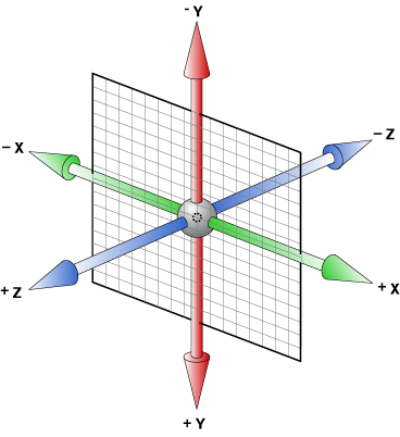
正向轴对着眼睛,顺时针则旋转角度为正,逆时针则旋转角度为负。
或者用左手法则也行:伸出左手,大拇指指向正轴方向,四个手指的指向即是旋转正向,但务必记住是左手!
- rotate3d
- rotateX +顺时针旋转,-逆时针旋转(X轴垂直平面)
- rotateY +顺时针旋转,-逆时针旋转(Y轴垂直平面)
- rotateZ +顺时针旋转,-逆时针旋转(Z轴垂直平面)
- scale3d
- scaleX +顺时针旋转,-逆时针旋转(X轴垂直平面)
- scaleY +顺时针旋转,-逆时针旋转(Y轴垂直平面)
- scaleZ +顺时针旋转,-逆时针旋转(Z轴垂直平面)
- translate3d
- translateX +顺时针旋转,-逆时针旋转(X轴垂直平面)
- translateY +顺时针旋转,-逆时针旋转(Y轴垂直平面)
css 2d坐标轴空间
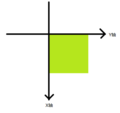
- rotate 顺时针为+,逆时针为-
- translate x为横轴,y为纵轴
- scale x为横轴,y为纵轴
- skew
- skewX +顺时针旋转,-逆时针旋转
- skewY +顺时针旋转,-逆时针旋转
边框与背景
半透明边框
背景知识:👉 background-clip
默认情况下,背景的颜色会延伸至边框下层,这意味着我们设置的透明边框效果会被覆盖掉,在css3中,我们可以通过设置background-clip:padding-box来改变背景的默认行为,达到我们想要的效果。
See the Pen translucent-borders by qiyoe (@qiyoe) on CodePen.
多重边框
背景知识:👉 box-shadow, outline, outline-offset
box-shadow相信很多人都已经用透了,可用来给元素添加各种阴影效果,反过来,也只有我们需要实现阴影时才会想起它,其实,box-shadow还接受第四个参数作为阴影扩张半径,当我们只设置扩张半径时,零偏移,零模糊,产生的效果其实相当于一条实线“边框”。
box-shadow只能模拟实线边框效果,某些情况下,我们可能需要生成虚线的边框效果,我们可以通过类似于border的描边outline和对应的描边偏移outline-offset来实现。
See the Pen multiple-borders by qiyoe (@qiyoe) on CodePen.
边框内圆角
背景知识:👉 box-shadow, outline
我们知道box-shadow是会紧贴border-radius圆角边的,但是,描边outline并不会与圆角边border-radius贴合,我们可以将两者组合,通过box-shadow去填补描边outline所产生的间隙来达到我们想要的效果。
关于扩张半径的取值?
假设圆角border-radius的半径为r,根据勾股定理,扩张半径的最小值应等于(√2−1)r ~= 3.314,最大值不能超过描边宽度,即6px。
See the Pen inner-rounding by qiyoe (@qiyoe) on CodePen.
背景定位
背景知识:👉 background-position, background-origin, calc
See the Pen extended-bg-position by qiyoe (@qiyoe) on CodePen.
条纹背景
背景知识:👉 gradient, linear-gradient, radial-gradient, repeating-linear-gradient
- 进度条
See the Pen stripes-background-linear by qiyoe (@qiyoe) on CodePen.
- 不规则卡片
See the Pen stripes-background-radial by qiyoe (@qiyoe) on CodePen.
示例中为了实现:hover时有贴边的阴影,所以采用了
radial-gradient。
1px 线/边
背景知识:👉 box-shadow, transform, @media
box-shadow+transform实现 1px 线条
See the Pen one-pixel-line by qiyoe (@qiyoe) on CodePen.
border+伪元素+transform实现 1px 独立边框 👍
See the Pen one-pixel-line-border by qiyoe (@qiyoe) on CodePen.
常见形状
圆与椭圆
背景知识:👉 border-radius
通常我们一般使用border-radius来时实现圆角效果,其实border-radius是可以单独指定它的半长轴和半短轴,只需要用“/”分割即可。我们可以通过这个属性轻松实现半圆、半椭圆、四分之一圆及四分之一圆等常见的图形。
See the Pen ellipse by qiyoe (@qiyoe) on CodePen.
parallel四边形
See the Pen parallelogram by qiyoe (@qiyoe) on CodePen.
切角效果
See the Pen bevel-corners by qiyoe (@qiyoe) on CodePen.
简易饼图
See the Pen pie-chart by qiyoe (@qiyoe) on CodePen.
提示气泡
背景知识:👉 transition, transform, filter
dark主题
See the Pen poptip-dark by qiyoe (@qiyoe) on CodePen.
light主题:filter: drop-shadow()
See the Pen poptip-light by qiyoe (@qiyoe) on CodePen.
- 什么是“CSS Filter Effects”?
其他多边形
背景知识:👉 box-sizing, transform
See the Pen polygon by qiyoe (@qiyoe) on CodePen.
视觉效果
常见投影
背景知识:👉 box-shadow
See the Pen single-projection by qiyoe (@qiyoe) on CodePen.
不规则投影
背景知识:👉 filter, radial-gradient, border-image
See the Pen irregular-projection by qiyoe (@qiyoe) on CodePen.
毛玻璃投影
背景知识:👉 hsla/rgba
注意
background: background-color, background-image, background-repeat, background-attachment, background-position / background-size, background-origin, background-clip
font: font-style, font-variant, font-weight, font-size/line-height, font-family
See the Pen frosted-glass by qiyoe (@qiyoe) on CodePen.
斑马条纹
背景知识:👉 linear-gradient
See the Pen zebra-stripes by qiyoe (@qiyoe) on CodePen.
文字特效
背景知识:👉 text-shadow, filter, -webkit-text-fill-color, -webkit-text-stroke
See the Pen text-effects by qiyoe (@qiyoe) on CodePen.
文本截断(溢出)
See the Pen text-overflow by qiyoe (@qiyoe) on CodePen.
环形文字
背景知识:👉 SVG, transition
See the Pen circular-text by qiyoe (@qiyoe) on CodePen.
插入换行
背景知识:👉 Unicode, white-space
在Unicode中,0x000A字符是专门控制换行的。在CSS中,我们可以写为\000A或\A,我们可以用它来作为::after伪元素的内容,并将其添加到指定元素的尾部,实现换行效果。
See the Pen circular-text by qiyoe (@qiyoe) on CodePen.
注意
上述代码中,通过伪元素在多个span.bold元素间添加的逗号前面会有一个空格,负外边距margin-left: -.25em;的作用是抵消所出现的空隙。
图片对比控件
背景知识:👉 resize, HTML < input[type=range] >
See the Pen circular-text by qiyoe (@qiyoe) on CodePen.
创造良好的用户体验应当养成一种习惯~
用户体验
创造良好的用户体验应当养成一种习惯~
选择合适的鼠标光标
背景知识:👉 cursor
See the Pen mouse-cursor by qiyoe (@qiyoe) on CodePen.
扩大可点击区域
背景知识:👉 box-shadow, filter
See the Pen mouse-cursor by qiyoe (@qiyoe) on CodePen.
自定义复选框
背景知识:👉 transition, transform
See the Pen custom-checkbox by qiyoe (@qiyoe) on CodePen.
自定义单选框
背景知识:👉 transition, transform
See the Pen custom-radio by qiyoe (@qiyoe) on CodePen.
自定义开关选择器
背景知识:👉 transition, 伪元素
同自定义复选框或自定义单选框类似,都是利用一个隐藏的input(:checked)元素 + 一个关联的label元素,通过label元素及其伪元素模拟switch选择器,通过input的:checked属性来模拟switch状态是否开启。
See the Pen custom-radio by qiyoe (@qiyoe) on CodePen.
输入框完美居中
See the Pen input-align by qiyoe (@qiyoe) on CodePen.
通过阴影弱化背景
背景知识:👉 css-boxshadow, HTML < dialog >
See the Pen shadow-weaken-background by qiyoe (@qiyoe) on CodePen.
通过模糊弱化背景
背景知识:👉 css-boxshadow, HTML < dialog >
See the Pen blurry-weaken-background by qiyoe (@qiyoe) on CodePen.
自定义文字下划线
背景知识:👉 linear-gradient, text-shadow, text-decoration
通过text-decoration: underline实现的下划线存在很多问题,比如无法控制位置、无法实现避让(text-decoration-skip浏览器几乎都不支持)、更重要的是无法满足强迫症患者的需求,并且不同语言有不同的对齐习惯,中文以中心对齐,英文以基线对齐,所以建议通过自定义来实现下划线。
box-shadow模拟下划线效果
See the Pen underline-solid-cn-shadow by qiyoe (@qiyoe) on CodePen.
- 伪元素
after模拟下划线效果
See the Pen underline-solid-cn-after by qiyoe (@qiyoe) on CodePen.
自定义scroll滚动条
背景知识:👉 box-shadow, ::-webkit-scrollbar
See the Pen scrollbar by qiyoe (@qiyoe) on CodePen.
注意
兼容性很差,并且很多样式不可控,建议在生产环境中采用类似 perfect-scrollbar 的方案。
结构布局
全背景等宽内容居中
背景知识:👉 calc()
将元素左右padding设置为父元素宽度的50%减去等宽内容的一半即可,无需设置width~
See the Pen fluidFixed by qiyoe (@qiyoe) on CodePen.
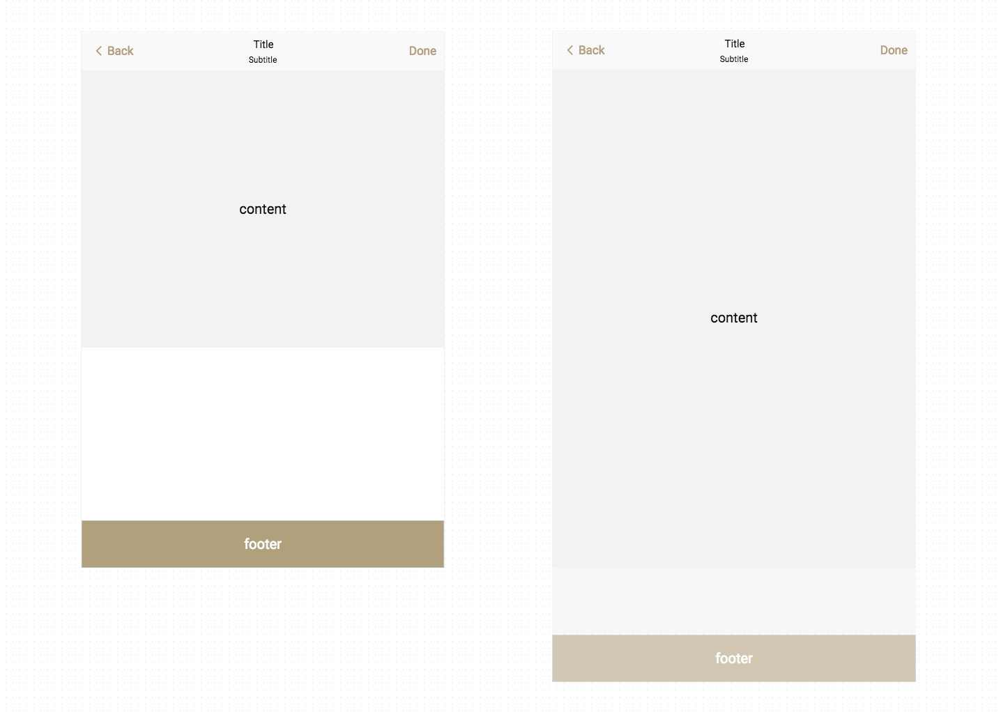
绝对底部
什么是“Sticky Footer”
所谓 Sticky Footer 是指一种网页效果,如果页面内容不足够长时,页脚紧贴在视口的最底部;如果内容足够长时,页脚紧跟在内容的下方。效果大致如图所示:
- 利用计算函数
calc()计算(视窗高度 - 页头高度 - 页脚高度)赋予内容区最小高度
See the Pen sticky-calc by qiyoe (@qiyoe) on CodePen.
- Flexbox
display: flex👍
See the Pen sticky-flex by qiyoe (@qiyoe) on CodePen.
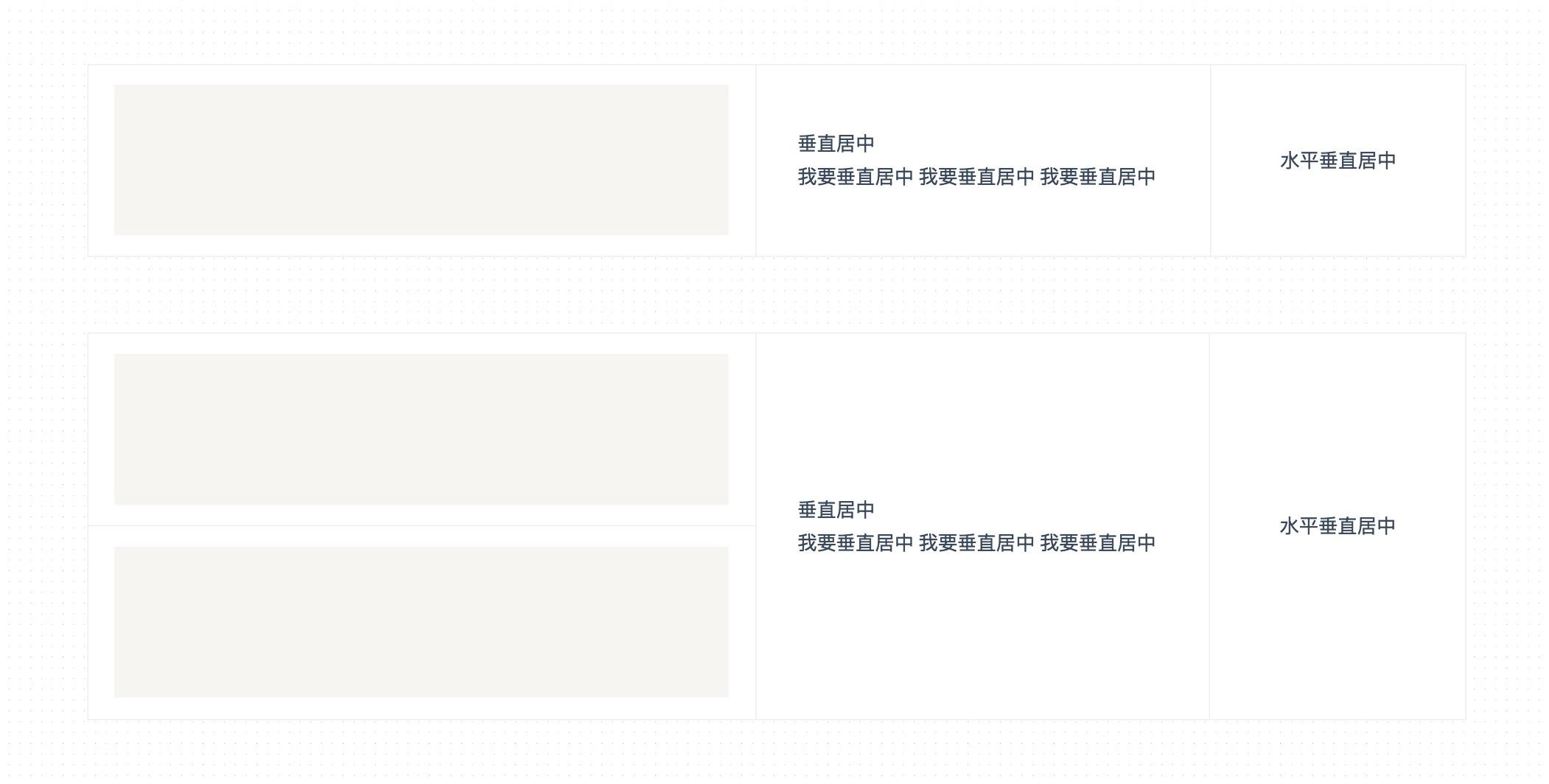
水平垂直居中
display: flex+margin: auto不限定宽高 👍
See the Pen flex by qiyoe (@qiyoe) on CodePen.
display: grid不限定宽高 👍
See the Pen grid by qiyoe (@qiyoe) on CodePen.
- 绝对定位
position: absolute限定宽高
See the Pen position by qiyoe (@qiyoe) on CodePen.
- 绝对定位
position: absolute+calc()限定宽高
See the Pen calc by qiyoe (@qiyoe) on CodePen.
- 绝对定位
position: absolute+translate不限定宽高 👍
See the Pen translate by qiyoe (@qiyoe) on CodePen.
- 仿table布局
display: table/table-cell+vertical-align: middle不限定宽高
See the Pen table by qiyoe (@qiyoe) on CodePen.
- 伪元素
:after+vertical-align:middle不限定宽高
See the Pen after by qiyoe (@qiyoe) on CodePen.
使用vertical-align实现居中时,居中元素display的值,必须为inline-block/inline,否则无法垂直居中,这是因为vertical-align只能用来指定行内元素(inline)或表格单元格(table-cell)元素的垂直对齐方式。更多请查看MDN vertical-align
圣杯布局
此布局一般的需求为两边等宽,中间自适应的三栏布局。
See the Pen holy-grail-layout by qiyoe (@qiyoe) on CodePen.
双飞翼布局
此布局的需求同圣杯布局一样,都为两边等宽,中间自适应的三栏布局,源自淘宝UED
See the Pen double-wing-layout by qiyoe (@qiyoe) on CodePen.
圣杯布局和双飞翼布局的区别
圣杯布局和双飞翼布局解决问题的方案在前一半是相同的,也就是三栏全部float浮动,但左右两栏加上负margin让其跟中间栏div并排,以形成三栏布局。
不同在于解决”中间栏div内容不被遮挡“问题的思路不一样:圣杯布局,为了中间div内容不被遮挡,将中间div设置了左右padding-left和padding-right后,将左右两个div用相对布局position: relative并分别配合right和left属性,以便左右两栏div移动后不遮挡中间div。
双飞翼布局,为了中间div内容不被遮挡,直接在中间div内部创建子div用于放置内容,在该子div里用margin-left和margin-right为左右两栏div留出位置。多了1个div,少用大致4个css属性(圣杯布局中间divpadding-left和padding-right这2个属性,加上左右两个div用相对布局position: relative及对应的right和left共4个属性,一共6个;而双飞翼布局子div里用margin-left和margin-right共2个属性,6-2=4),个人感觉比圣杯布局思路更直接和简洁一点。
类订单布局
背景知识:👉 水平垂直居中
此布局一般的需求为左侧高度不固定,右侧自适应高度并且居中。
- 伪元素
:after+vertical-align:middle方案
See the Pen class-order-layout by qiyoe (@qiyoe) on CodePen.
- 伪元素
display: flex方案
See the Pen dlayout-flexbox by qiyoe (@qiyoe) on CodePen.
Flex布局
背景知识:👉 flex, flex 布局的基本概念
Flex 布局的全称为 CSS Flexible Box Layout Module,是 W3C 提出的一种新型页面布局方案,第一个版本于 2009 年推出,到现在为止,W3C 一共发布了 12 个版本,最新版本于 20171019 推出,已经得到了所有主流浏览器的支持,所以请大胆的使用吧~
Flexbox 原理演示
Flex 布局由容器flex container和项目flex item两部分组成,容器默认存在两根轴:水平的主轴main axis和垂直的交叉轴cross axis,项目默认以主轴排列。 Flex 属性包括容器属性和项目属性两部分,容器上可设置:flex-direction、flex-wrap、flex-flow、justify-content、align-items、align-content6 个属性,项目上同样可设置 6 个属性,分别为:order、flex-grow、flex-shrink、flex-basis、flex、align-self。示例如下:
- 容器属性
- flex-direction 属性
作用: 决定主轴的方向。
flex-direction: row | row-reverse | column | column-reverse;
- row:默认值,主轴为水平方向,表示从左向右排列
- row-reverse:主轴为水平方向,从右向左排列
- column:主轴为垂直方向,从上向下排列
- column-reverse:主轴为垂直方向,从下向上排列
See the Pen flexDirection by qiyoe (@qiyoe) on CodePen.
- 容器属性
- flex-wrap 属性
作用: 决定项目在一条轴线排不下时如何换行。
flex-wrap: nowrap | wrap | wrap-reverse;
- nowrap:默认值,不换行
- wrap:换行,第一行在上方
- row-reverse:换行,第一行在下方
See the Pen flexWrap by qiyoe (@qiyoe) on CodePen.
- 容器属性
- flex-flow 属性
作用: flex-direction属性和flex-wrap属性的简写形式,默认值为 row nowrap。
flex-flow: <flex-direction> || <flex-wrap>;
- row nowrap:默认值,主轴为水平方向,不换行
<flex-direction><flex-wrap>
- 容器属性
- justify-content 属性
作用: 定义项目在主轴上的对齐方式。
justify-content: flex-start | flex-end | center | space-between | space-round |
  space-evenly;
- flex-start:默认值,左对齐
- flex-end:右对齐
- center:居中
- space-evenly:每个项目之间及两端的间隔都相等
- space-around:每个项目两侧间隔相等
- space-between:两端对齐,项目之间间隔相等
See the Pen justifyContent by qiyoe (@qiyoe) on CodePen.
- 容器属性
- align-items 属性
作用: 定义项目在交叉轴(默认方向从上到下)上的对齐方式。
align-items: flex-start | flex-end | center | baseline | stretch;
- flex-start:交叉轴的起点对齐
- flex-end:交叉轴的终点对齐
- cente:交叉轴的中心对齐
- baseline:项目第一行文字的基线对齐
- stretch:默认值,项目未设置固定高度时,将占满整个容器
See the Pen alignItems by qiyoe (@qiyoe) on CodePen.
- 容器属性
- align-content 属性
作用: 定义了多根轴线的对齐方式。如果项目只有一根轴线,该属性不起作用
align-content: flex-start | flex-end | center | space-between | space-around |
  stretch;
- flex-start:交叉轴的起点对齐
- flex-end:交叉轴的终点对齐
- center:交叉轴的中心对齐
- space-between:与交叉轴两端对齐,轴线之间的间隔平均分布
- space-around:每根轴线两侧的间隔都相等
- stretch:默认值,轴线占满整个交叉轴
See the Pen alignContent by qiyoe (@qiyoe) on CodePen.
- 项目属性
- order 属性
作用: 定义项目的排列顺序。
order: <number>;
<number>:值为整数,数值越小,排列越靠前,默认为 0
See the Pen order by qiyoe (@qiyoe) on CodePen.
- 项目属性
- order 属性
作用: 定义项目的排列顺序。
order: <number>;
<number>:值为整数,数值越小,排列越靠前,默认为 0
See the Pen order by qiyoe (@qiyoe) on CodePen.
- 项目属性
- flex-grow 属性
作用: 定义项目的伸缩比例,按照该比例给项目分配空间。
flex-grow: <number>;
<number>:值为整数,数值越大,项目占据空间越大,默认为 0
See the Pen flexGrow by qiyoe (@qiyoe) on CodePen.
- 项目属性
- flex-shrink 属性
作用: 定义项目的收缩比例,按照该比例给项目分配空间。
flex-shrink: <number>;
<number>:值为整数,数值越大,项目占据空间越小,默认为 1
See the Pen flexShrink by qiyoe (@qiyoe) on CodePen.
- 项目属性
- flex-basis 属性
作用: 定义在分配多余空间之前,项目占据的主轴空间。浏览器根据这个属性,计算主轴是否有多余空间。
flex-basis: <length> | auto;
<length>:默认为 auto,即项目的原始尺寸;也可设置和 width 或 height 属性一样的值(比如 329px),则项目将占据固定空间。
See the Pen flexBasis by qiyoe (@qiyoe) on CodePen.
- 项目属性
- flex 属性 👍
作用: 是flex-grow,flex-shrink和flex-basis的简写,后两个属性可选。
flex: none | [ < "flex-grow" > < "flex-shrink" >? || < "flex-basis" > ];
0 1 auto:默认值,不伸缩,如果容器空间不足则等比例收缩1 1 auto:对应关键字auto,如果容器空间多余,则等比例分配多余空间空间;如果容器空间不足则等比例收缩0 0 auto:对应关键字none,按项目原始大小分配空间
- 项目属性
- align-self 属性
作用: 定义单个项目的对齐方式,可覆盖 align-items 属性。
align-self: auto | flex-start | flex-end | center | baseline | stretch;
- auto:默认值,继承父元素的
align-items属性,如果没有父元素,则等同于 stretch- flex-start:交叉轴的起点对齐
- flex-end:交叉轴的终点对齐
- center:交叉轴的中心对齐
- baseline:项目第一行文字的基线对齐
- stretch:未设置固定高度是,将占满整个容器
See the Pen alignSelf by qiyoe (@qiyoe) on CodePen.
动画过渡
弹跳效果
背景知识:👉 animation, timing-function, transform
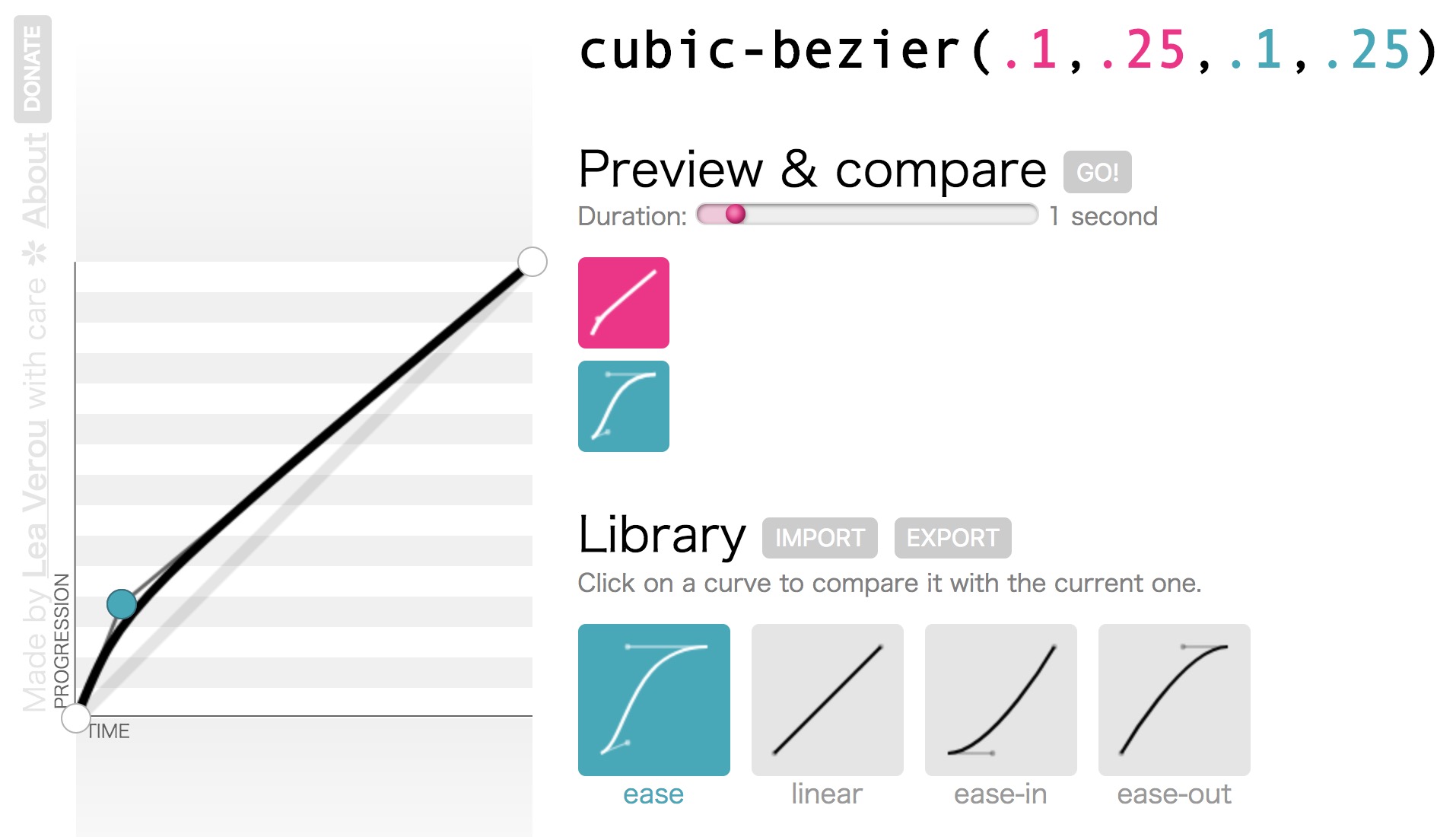
小球下落过程属于自由落体运动,在时间函数timing-function中,ease(更快的加速度)相对更接近于自由落体运动,所以下落过程我们选用ease作为时间函数的关键值;当小球被弹起时属于减速运动,我们需用使用ease的方向版本cubic-bezier(.1,.25,.1,.25)(更快的减速度)作为时间函数的函数值来模仿减速运动。调速函数如下图所示:
See the Pen bounce by qiyoe (@qiyoe) on CodePen.
弹性过渡
背景知识:👉 animation, transition
一切的过度皆应该由动画来完成
animation方案 👍
See the Pen elastic-animation by qiyoe (@qiyoe) on CodePen.
- 三次贝塞尔
cubic-bezier+transition方案
See the Pen elastic-transtion by qiyoe (@qiyoe) on CodePen.
三次贝塞尔曲线cubic-bezier主要是为animation生成速度曲线的函数,语法是cubic-bezier(<x1>, <y1>, <x2>, <y2>),更多请参考:Lea Verou的图形化工具cubic-bezier
闪烁效果
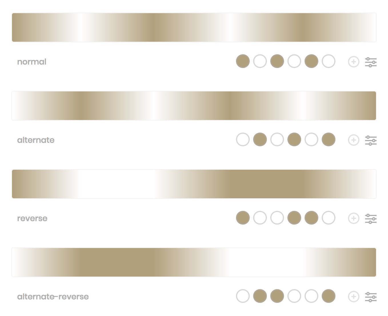
背景知识:👉 animation-direction
animation-direction属性接受的值共有四个,为了你能从视觉上直接理解其作用,我以下图一段从#FFFFFF变化到#b4a078并循环三次的动画为例,展示了这四个值各自对动画的作用效果。
See the Pen blink by qiyoe (@qiyoe) on CodePen.
打字效果
背景知识:👉 animation, animation-timing-function
See the Pen typing by qiyoe (@qiyoe) on CodePen.
注意
此方法仅限单行等宽字体~
抖动效果
背景知识:👉 animation
- See 百度
See the Pen shakeBaidu by qiyoe (@qiyoe) on CodePen.
- See CSShake
See the Pen CSShake by qiyoe (@qiyoe) on CodePen.
无缝平滑效果
背景知识:👉 animation
- 图片平滑效果
See the Pen single-projection by qiyoe (@qiyoe) on CodePen.
上图为两张左右对称的图片拼接而成,效果不是很完美,在开发中,只需使用一张左右可以无缝对接(类似360°全景图)的图片即可更完美。
- 块平滑效果
See the Pen block-smooth by qiyoe (@qiyoe) on CodePen.
延轨迹平滑效果
背景知识:👉 animation, transition, transform, animation-delay
transform-origin 只是一个语法糖而已。实际上你总是可以用 translate() 来代替它。
See the Pen circular-smooth by qiyoe (@qiyoe) on CodePen.